Advocacy Chiefs
A firm whose value is tying together services buyers usually procure separately has to read as one practice, not five doorbells.
Advocacy Chiefs had moved past solo-shop energy: grants, policy advocacy, partnership threads, compliance, and campuses all answered the same voicemail, yet the wordmark still read like one specialist hung a shingle.
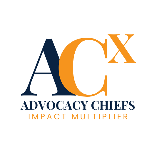
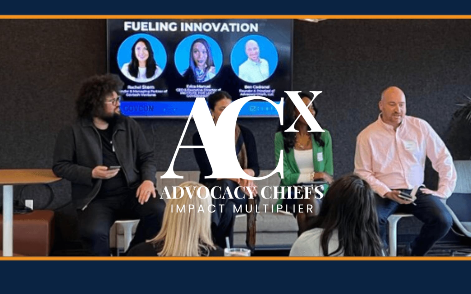
Discovery workshops surfaced Impact Multiplier, one desk compounding wins across services buyers normally split across vendors. The ACX mark spells the multiplication and cross-sector work in the lettering. Palette pairs navy for institutional rooms with orange for lean tech partners so Sacramento agencies and founders don’t get two brochures that pretend they aren’t siblings.
More than $30M in client-side funding traced to Advocacy Chiefs’ work sits in the record. We’re not crediting typography for that tally, only noting why collateral that still looked solo stopped working.
When reviewers stack your filings against your leave-behind, the visuals have to hold.