Every movement needs an icon, a flag, a symbol that unifies the members of their movement. These symbols can serve many purposes. They can serve a catalyst for stirring up fervor and rallying members, as is the case with many flags. For icons, which is relative to note, have their root in religious paintings of one or two portraits or a religious scene. Icons now most commonly serve as the symbols that provide direction as well as pertain to identity that we interact with on mobile devices. Icons have become a secondary shorthand for a brand. These are all important considerations for branding and identity.
With every brand comes the possibility that you help create something more, that around the brand forms a community of passionate advocates. When this happens, your brand (and along with it your logo) becomes a symbol. This is when your brand becomes an icon, a symbol of the community, a common experience or perspective.
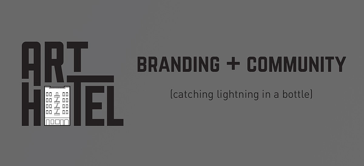
We saw this occur earlier this year in February. It was actually about a year ago when I volunteered our team to develop the brand for an unheard of arts project, Art Hotel. The development of the logo did not take long, but we did go through a handful of concepts with the M5Arts team. The result was something actually quite simple and figurative, including an outline of the building used in the project.
Art Hotel took off in a big way. The arts experience was sold out, covered by all of the region’s media and became a symbol of Sacramento’s burgeoning arts scene. Suddenly the artwork was on tee-shirts, hoodies and all over the news. Our little brand had become a symbol that represented the work of the M5Arts team, the 130 artists that worked on the project, their many donors and the broader community that experienced Art Hotel during its short 10 day run.
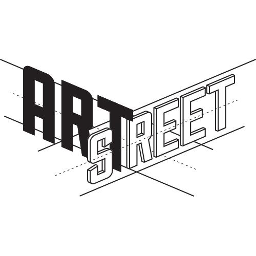
Earlier this month we unveiled a new logo representing the next M5Arts project, ArtStreet, at a Kickstarter fundraising launch party. We agreed with the M5Arts team, that this next project should carry with it a similar visual language as Art Hotel. After beginning with some basic concepts, some feedback from the team and some art direction from my youngest daughter (thanks Kayla!), we ended up with an image we are pretty excited about. However, the brand is not ours. It no longer even belongs to M5Arts. It belongs to the community of people for whom the Art Hotel project meant something about their city and the artists who live here. For these people we hope that the new graphic comes to mean something once they have had the opportunity to experience ArtStreet. If M5Arts succeeds at catching lightning in a bottle twice, just maybe our humble logo will become another hit.

Disclaimer: I am a member of the M5Arts team as well as a board member of their fiduciary agent nonprofit, DBA Arts. MKTNG has donated design and PR services to the Art Hotel and ArtStreet projects.


